

Using Hero panels in Optimizely
'Hero panels' are the large, title sections usually located immediately below the website header and branding. They should set the theme and tone for the whole page.
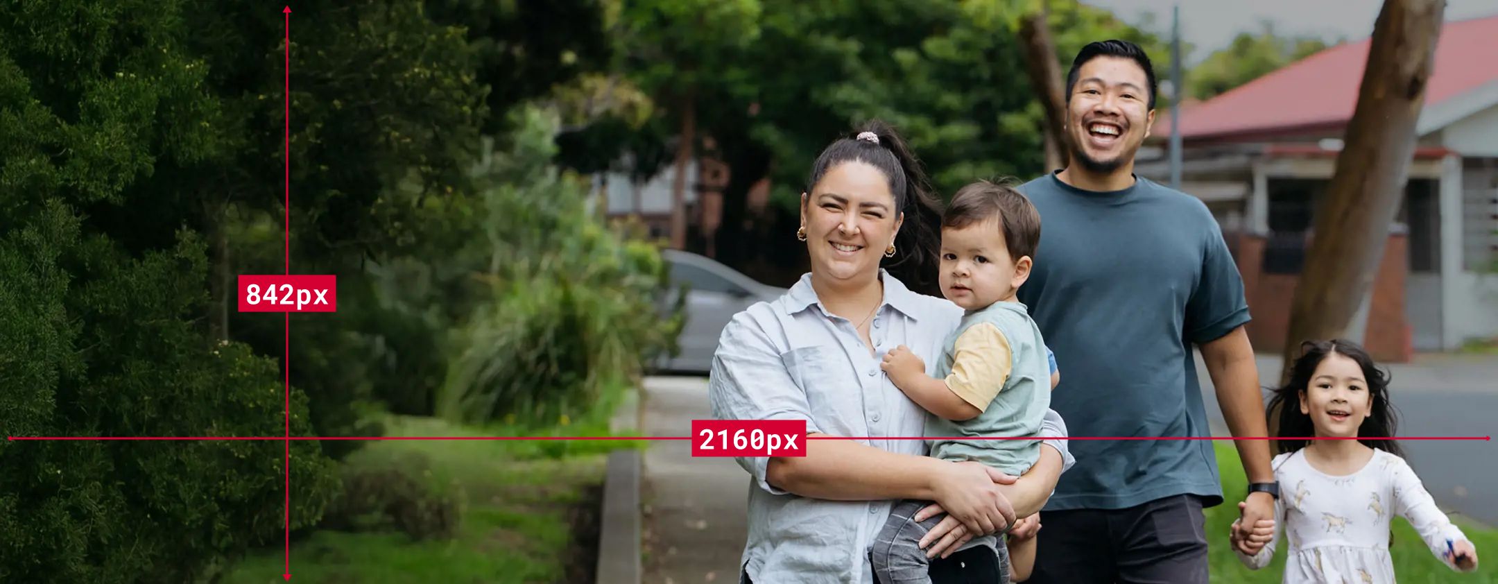
They may contain an image background but can also be flat navy. They can be sized either medium or large. When using a hero panel you will require both a custom desktop image (2160 x 842) and a mobile-ready version (585 x 749).
Let's talk about the best way to create them.
Creating desktop hero images
1. Create a landscape image that is exactly 2160 × 842 pixels
Optimizely crops every desktop hero image to this size. Starting with an image that is already 2160 × 842 pixels gives you control over what visitors see.
2. Leave clear space on the left for the hero text
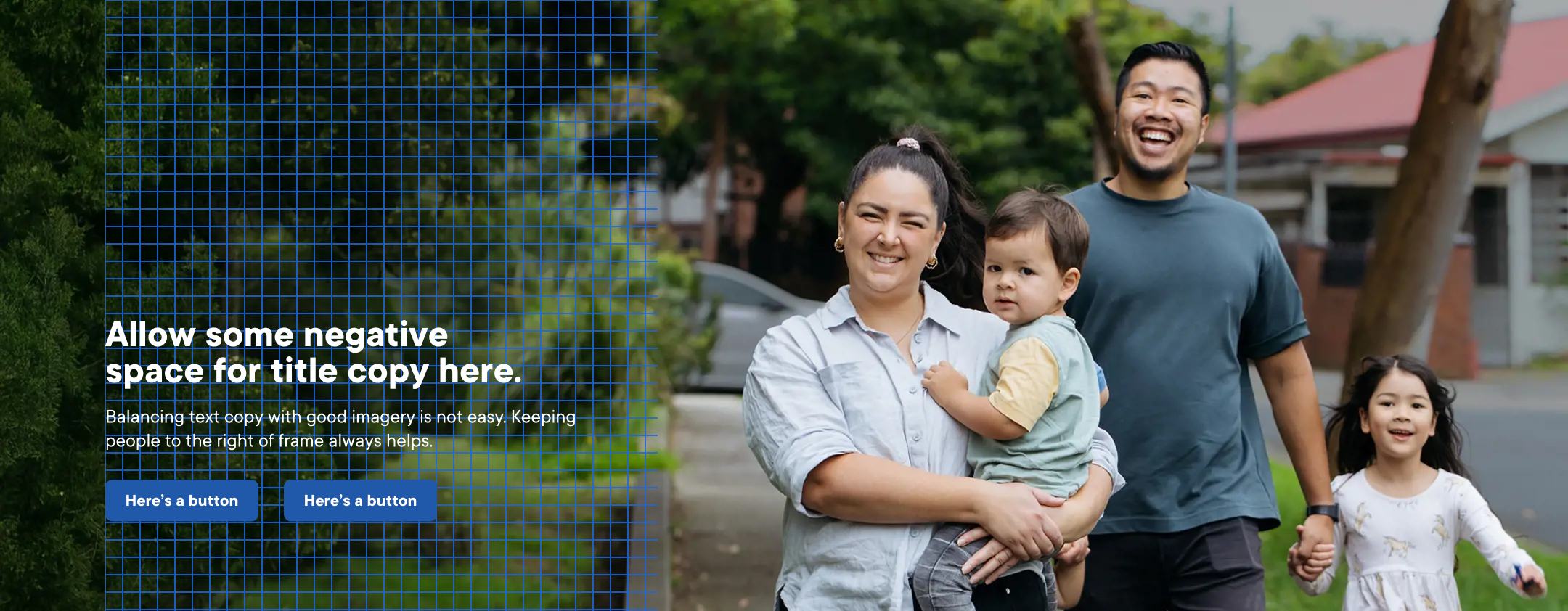
Hero text is always white and appears on the left side of the desktop image. Choose an image with people and important details on the right, leaving a clear, uncluttered area on the left for the title, description and button.
Avoid placing text over pale skies, fences, buildings or other light backgrounds. White text needs a darker, less detailed area behind it to remain easy to read.
 Tip: We have had some success using a 25% dark gradient rising vertically from the bottom edge and fading to nothing about a third of the way up (25% - 0%).
Creating high-quality mobile hero images
Many visitors will view this page on a phone, so always plan the mobile image as carefully as the desktop version. Optimizely will display your mobile image up to 778px before switching to the desktop hero you provided.
1. Getting the sizing right
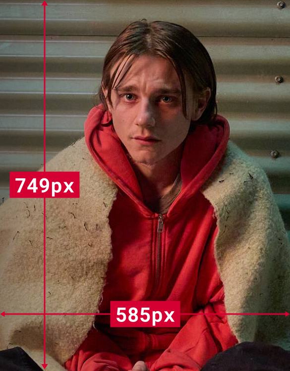
Upload a portrait image that is exactly 585 × 749 pixels.
Optimizely crops mobile hero images to these dimensions regardless. Supplying an image at the correct size gives you better control over what visitors see.
2. Keep the important part near the top.
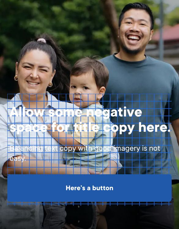
Place faces and other important details in the top third of the image. The lower part of the image may be covered by the hero title or cropped on some screens.
3. Keep the title short
Phone screens have limited space. A shorter title gives the image room to work and makes the page easier to read. Test the hero on a phone before publishing to make sure the title and image work well together.